
Express AgencyOur own project
Express Agency redesign: the whole site in three days
We are a web studio that lived with a generic website. This is how agents helped us rebuild all of it in three days: what we tried, what worked and where people still matter.
- 28
- pages
- 84
- URLs in three languages
- ≈70
- hours from the first prompt to the main site
- 3
- days
Content first, wrapper later
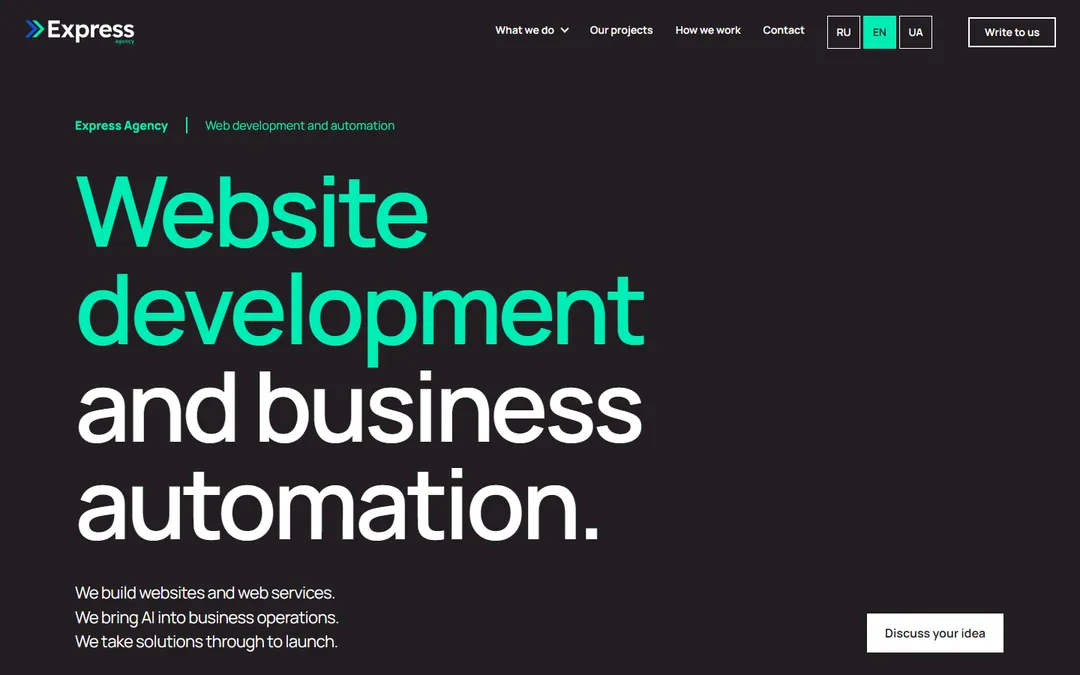
When we launched Express Agency, we had to choose: spend weeks on design, or first build what the site is for. Services, case studies, a request form, three languages. We chose the second. Agents built the site with ready-made design skills and a short style description in DESIGN.md, and we deliberately put almost nothing into the visuals. The result was a working site with a generic design: everything in place, everything readable, nothing memorable.
The decision came with a fallback plan. Someday we meant to rebuild the site into something richer, with 3D, video and other “wow” effects. But that is a lot of work, and at the start it was not justified.
Yet we are a web studio, and one of our services is redesign. Offering it to clients while showing them a generic site is wrong. We decided to close that contradiction on 27 October. The first prompt of the new redesign opened with an honest assessment:
«The current site looks like AI slop. It is too visually simple, yet you could hardly call it easy to use»
The site was meant to be simple: we had not invested in it. But “someday” ran out. The question became: how quickly can you build a good design using agents and new skills? The first prompt went out at 21:08. About 70 hours later, the new design was on the main branch.
Taste cannot simply be requested
The first thing we understood: the phrase “make it look good” tells an agent nothing. Left to itself, it produces the average of every site it has seen: a centred headline, three cards with icons, a soft gradient. That is exactly the genericness we wanted to escape.
The foundation was design skills, above all taste-skill. It makes the agent take design decisions instead of producing a template.
But rules alone are not enough: they protect against a template, they do not say what the result should look like. So next to the skill we put references. From five candidate sites we chose one and checked individual blocks against it: how sections are built, how dense and open screens alternate.
The agent made its first attempt in three directions: “Impulse”, “Editorial” and “Scale”. Each was shown on four pages, giving 12 combinations. The verdict was mixed:
«Better than before, but still not good enough: there are too few patterns and not enough visual variety»

“Study it deeper”
“Not enough” could have been answered with one more screen. We chose differently: we asked the agent to study the reference seriously.
The reference site's sitemap has almost a thousand URLs. The agent opened pages in a browser nearly two hundred times, examined 18 of them in detail at two screen widths, and separately read the stylesheets.
The conclusion was not about colours and fonts. The design rests on a system of chapters and rules for neighbouring blocks: a dense block next to an open one, text next to imagery, colours and scale never repeating back to back. We recorded these rules in the project documents, and they became the basis for every following page.
That is how version 02 appeared. The reaction was short:
«This is a big step forward compared with the previous version»
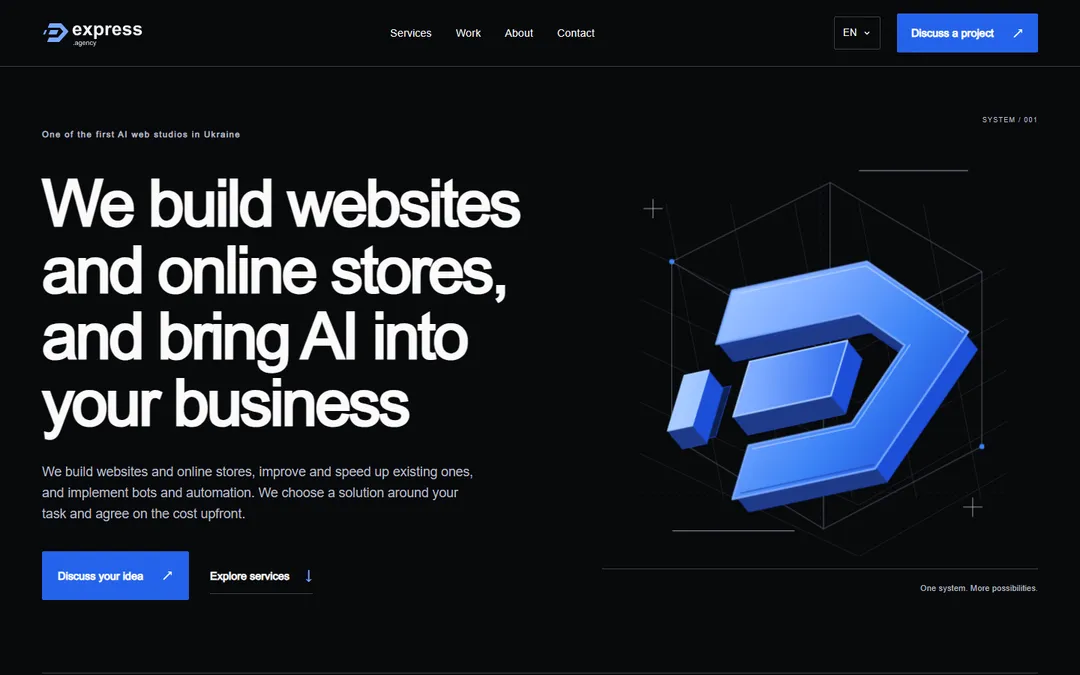
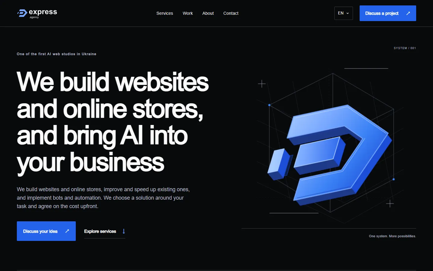
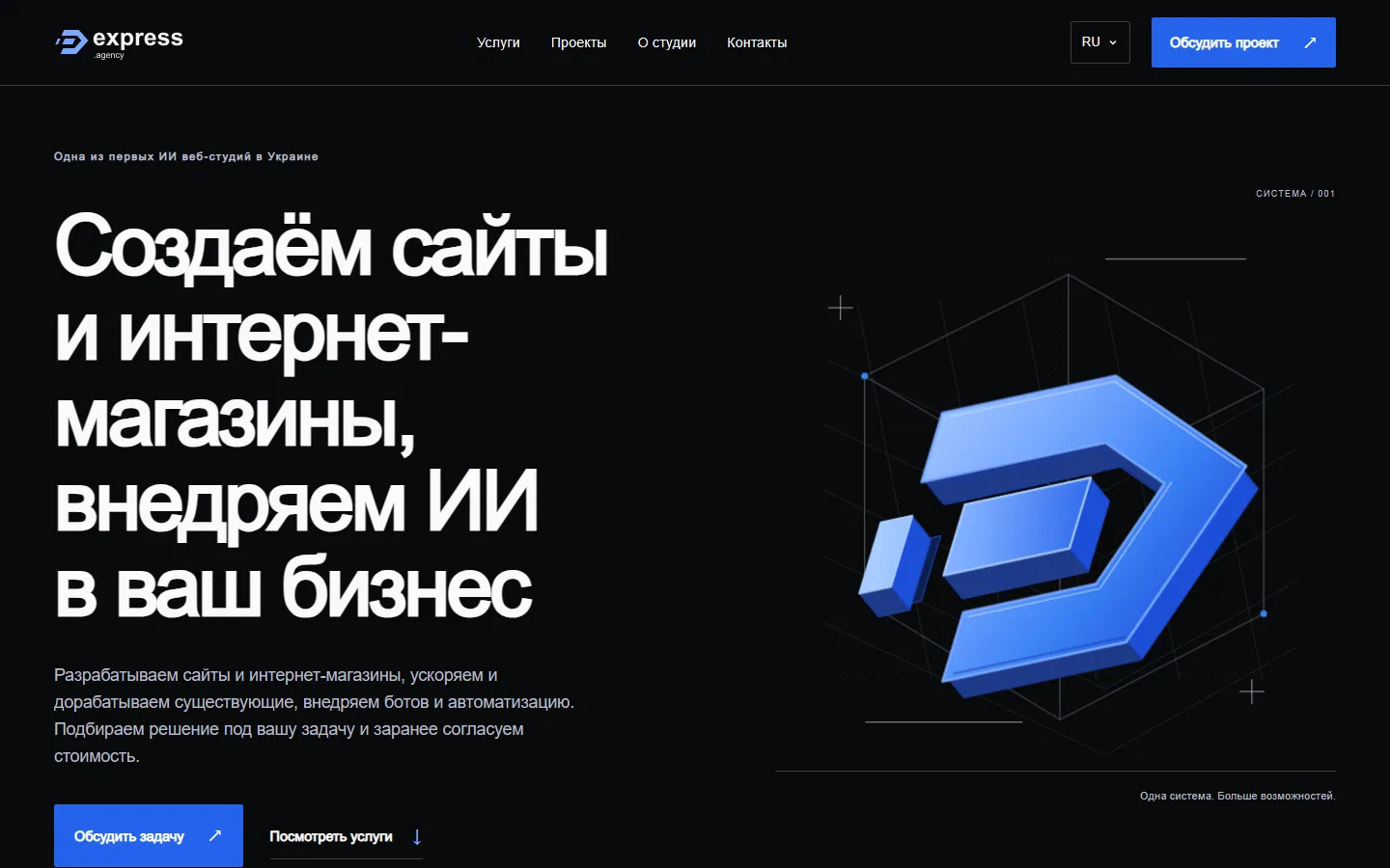
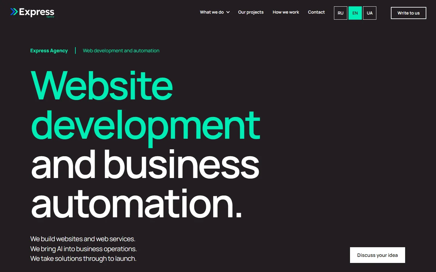
Below are all four states of the homepage, from the old site to the final design. Every frame opens full size.


1 / 4
Pages in batches, and rules against sameness
Once the system was fixed, the site grew in batches: 4 pages, then 10, 13, 18, 26 and finally 28. We reviewed a page in the browser and left comments right on its elements, and the agent processed them as a batch and returned a new version. Over those days we left 328 comments in 52 messages.
It quickly turned out that the main enemy is sameness. When sections look alike one after another, a page reads like a list, not a story. We sent such blocks back, and the agent proposed new options.
To avoid solving the same thing a hundred times, decisions became rules. From the comments the agent built a catalogue of 13 compositions that can alternate between sections. The price rule appeared the same way: first a trial on one page, then approval, and only then the whole site. The dollar sign and digits are now blue everywhere.
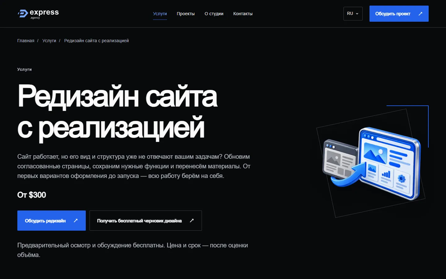
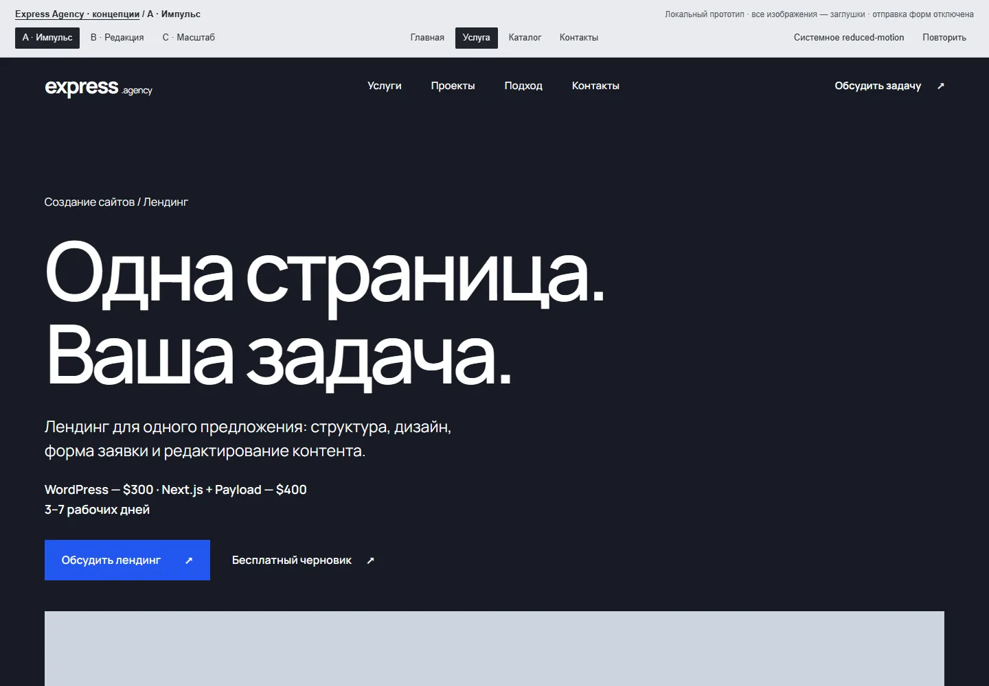
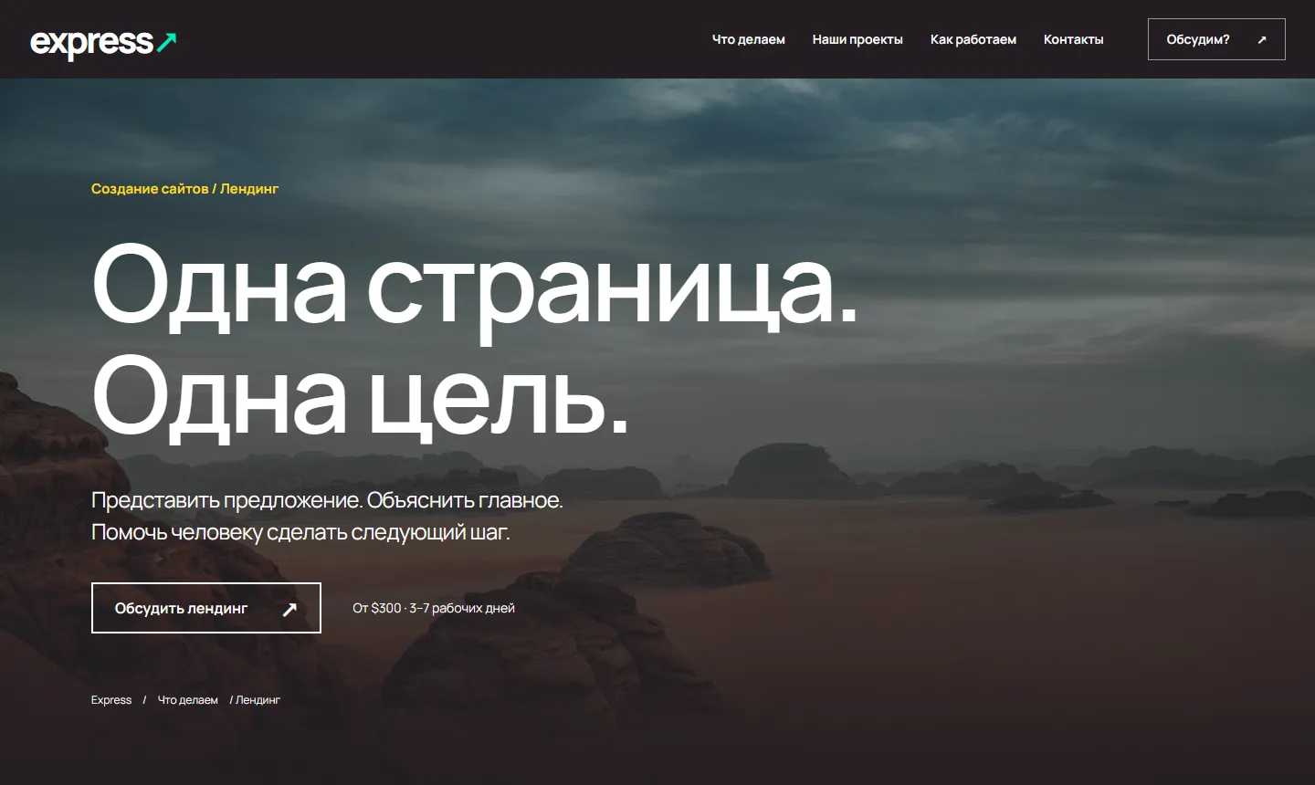
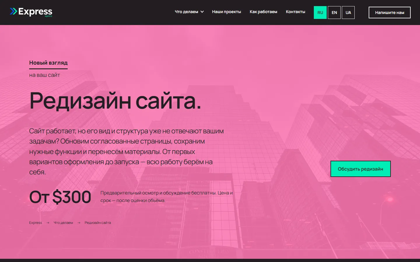
1 / 4
Fewer revisions over time
Looking at how many comments each page received, in order of appearance, a trend is visible. The homepage got 44 comments, the online store 29, the company site 15. Later WordPress pages got one to five, bot pages four to ten.
It is tempting to say the agent learned. But the data does not allow that much. The counts include sitewide changes on 29 October, such as button colours and the header. And the AIGC pages are not a redesign at all: we built entirely new landing pages with video and galleries that did not exist before, and only the texts survived from the old pages. That is why they drew so many comments: 40 and 23.
The order follows the first comment in the log and only roughly matches the order of creation. This is a work history, not an experiment. It seems that once the rules are fixed, a new page needs fewer revisions, but we do not claim to prove it.
- Home44
- Service catalogue6
- Contact8
- Landing page11
- About7
- ClonedGames case10
- Portfolio3
- Automation7
- Company website15
- Online store29
- Personal website10
- Site speed6
- Redesign6
- Web services14
- Site improvements6
- Maintenance16
- AI search13
- WordPress security20
- Messenger bot4
- Team assistant6
- AIGC video40
- AIGC for social media23
- WordPress improvements5
- WordPress support3
- WordPress speed1
- AI receptionist5
- Website chatbot10
Three languages and mobile
Every page had to exist in Russian, English and Ukrainian. Codex was the main agent, and Claude Code helped with the English and Ukrainian translations. As a result, 28 pages in three languages gave 84 URLs.
We also went through mobile screens and accessibility. The historical QA covered 91 browser profiles, and the automated axe check found no violations. This is not an accessibility certification, only automated control.



1 / 4
What people decided and what the agent did
Taste, choosing the direction and acceptance stayed with people. The agent does not know what we need until we tell it. And some decisions should not be entrusted to it at all, for example which design direction to choose.
A significant share of the revisions could have been avoided. That would have needed a better prompt, clear criteria for a good and a bad result, and a chance for the agent to check its own work before handing it in. The story of repetitive blocks showed this best.
On some of the new pages, four visually identical sections came in a row. The instruction was simple:
«A boring block, we need to rethink the design»
Yet that was enough for the agent to remove the problem completely. It could have been built into the original prompt as a criterion the agent uses to judge its own work before delivery.
The agent sped up routine work a lot. In our estimate, it did about 70% of the work from a couple of prompts, and the rest went into iterations. With refined instructions, in our estimate, the share could reach 90%, but that is a hypothesis, not a measurement.
For comparison: in our estimate, a manual redesign of this size would take at least three weeks, one to two of them designer's work. A benchmark for hand-coded pages is one to three responsive pages a day. That too is an estimate: we did not run a parallel project.
This case is not about traffic or conversion growth, and we make no such claim. It is about speed and how this kind of work is organised.
The other pages, before and after
We showed the homepage at the top. Here are the other key pages: drag the divider to compare.
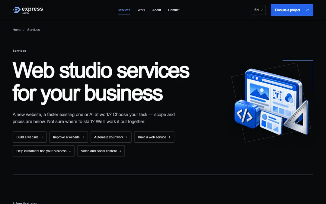
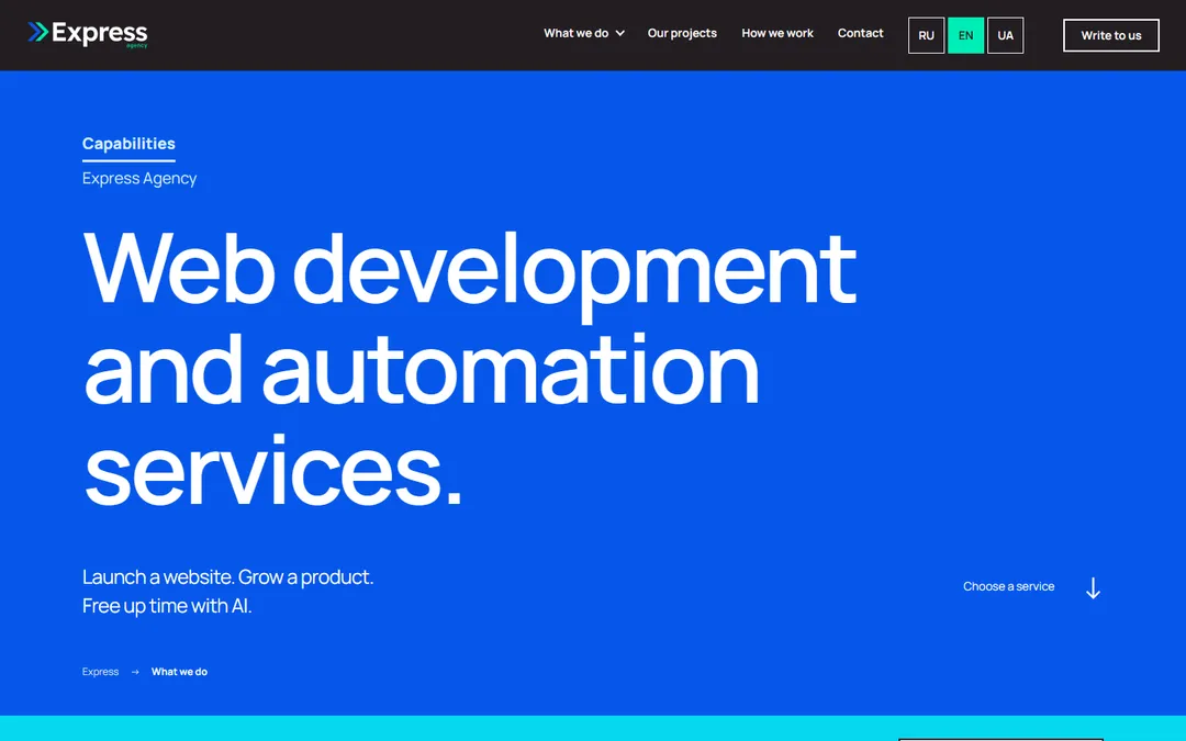
Service catalogue
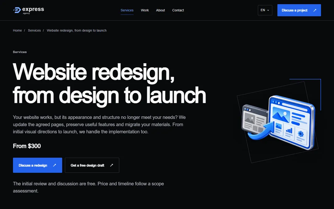
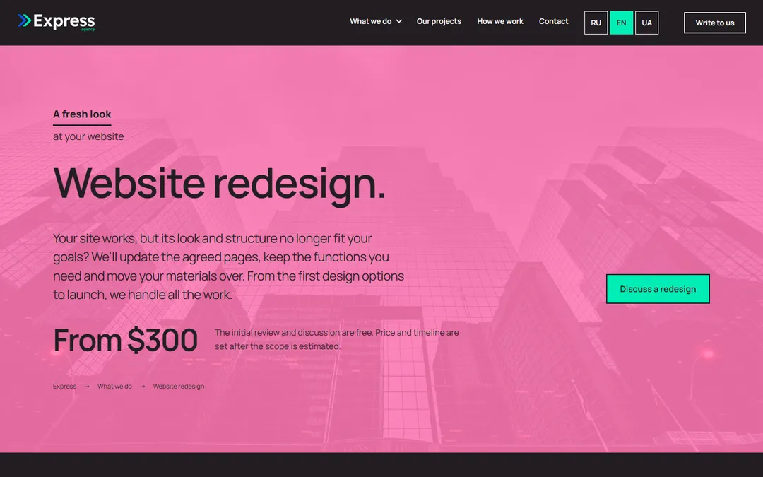
Service page
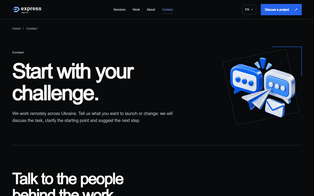
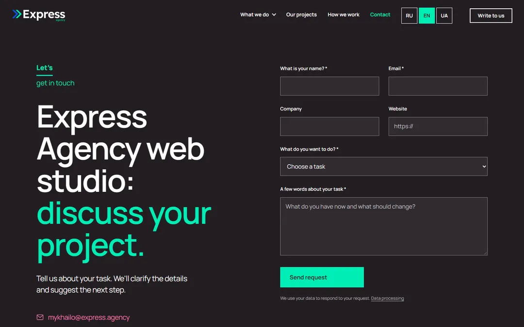
Contact
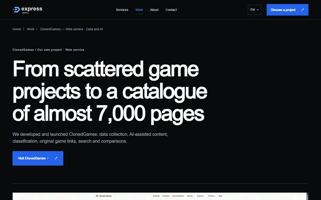
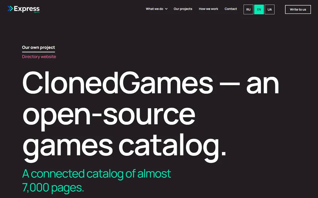
ClonedGames case study